In the realm of web design, colors transcend mere visual elements; they emerge as powerful tools that sculpt user experiences, convey emotions, and forge brand identities. Employing colors strategically can elicit diverse psychological responses, shaping users' perceptions, navigation decisions, and overall interaction with a website. This article delves into the psychological subtleties of different colors and their application in web design, while also touching upon the tools I utilize to discover and experiment with a variety of color palettes.
Colors in webdesign
Colors possess the remarkable ability to evoke emotional and psychological responses in individuals. Different colors are associated with distinct emotions and moods. For instance, warm colors like red and orange often evoke feelings of excitement and energy, while cooler tones like blue and green tend to convey calmness and serenity. Web designers harness this psychological impact to influence users' attitudes and behaviors while interacting with a website.
Red: The color red pulses with passion, excitement, and love, making it a powerful tool for eliciting strong emotions. However, its intense nature also carries the potential for anger or urgency. While red is effective for invoking enthusiasm, caution must be exercised when targeting older or conservative audiences, as its vibrancy might overwhelm their sensibilities.
Orange: Positioned between the fiery red and sunny yellow, orange radiates playfulness and encouragement. Its vibrancy is less aggressive than red, making it ideal for call-to-action (CTA) buttons that need to grab attention without overwhelming users. This color can infuse energy and warmth into a design, fostering engagement.
Yellow: A beacon of energy and optimism, yellow mirrors the sun's radiance. Its brightness evokes happiness and positivity, making it an excellent choice for imbuing a sense of cheerfulness into web designs. Caution is advised, however, as excessive use of yellow can strain the eyes.
Green: As the color of nature, harmony, growth, and security, green offers a tranquil sanctuary for users. Its association with money adds a layer of financial trustworthiness. Commonly used for CTA buttons, green beckons users forward, offering a serene invitation to explore further.
Blue: Blue spans the spectrum from peace and tranquility to trust and corporate reliability. It's a versatile hue often found in corporate identities. However, designers must be mindful of its potential to evoke feelings of coldness or depression. When wielded judiciously, blue can create an atmosphere of professionalism and reassurance.
Violet: A color of mystique and luxury, violet exudes spirituality and creativity. Its regal undertones make it a splendid choice for conveying opulence and exclusivity. However, its boldness demands careful use to avoid overpowering the user experience.
Pink: Evoking love, youth, and femininity, pink casts a gentle spell on designs. Often used for items like jewelry or cosmetics, pink resonates with a sense of delicate beauty. Its effectiveness lies in its ability to evoke tenderness without compromising sophistication.
Black: Black commands attention with an air of power, exclusivity, and mystery. While it signifies elegance, it also carries connotations of death or darkness. In web design, black can create a dramatic backdrop that elevates other elements. Paired with white, it forms a high-contrast combination that enhances text legibility.
White: Radiating innocence, purity, and simplicity, white is a canvas of endless possibilities. A staple in minimalist designs, white spaces allow other colors to breathe and stand out. Its pristine aura promotes clarity and ease of navigation.
Brown: Rooted in nature, brown embodies qualities like durability and ruggedness. Often used for backgrounds and textures, brown provides a stable foundation that balances stronger colors and imparts a sense of groundedness.
Gray: A neutral shade that adapts to its surroundings, gray is a chameleon among colors. When used as a background, it amplifies the intensity of other colors while retaining a sense of subtlety. Its versatility enhances the design's overall coherence.
Online Tools for finding the right colors
Let's explore the tools I frequently turn to when seeking color inspiration. We'll begin with something familiar to all: Google. Yes, utilize Google to search for images and spark your creativity. However, you're probably not here for the obvious; let's delve into something more intriguing:
Pinterest, Dribbble, Behance
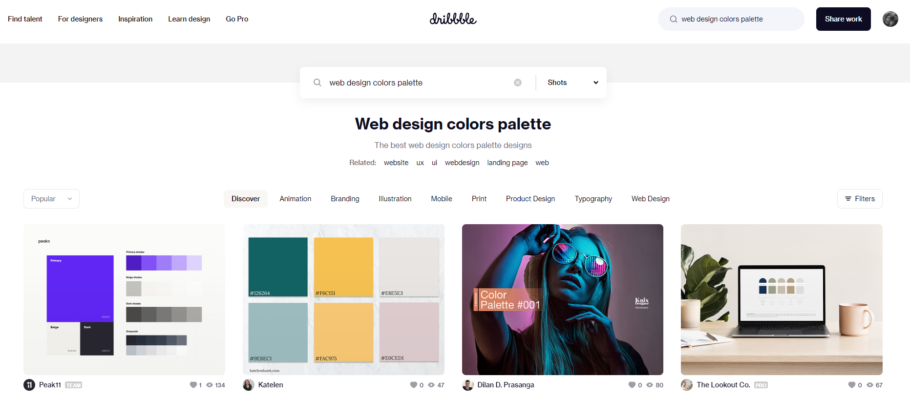
These are the primary websites I turn to when seeking inspiration. You can use keywords like 'web design color palettes,' or simply stick to appropriate keywords. If you're designing a fashion store, explore fashion-related content; if it's a website for foresters, search for forest images. Also, they are great for making mood boards by saving the others work into collections. How do you extract colors from the images you discover? That leads us to the next tool I often employ.
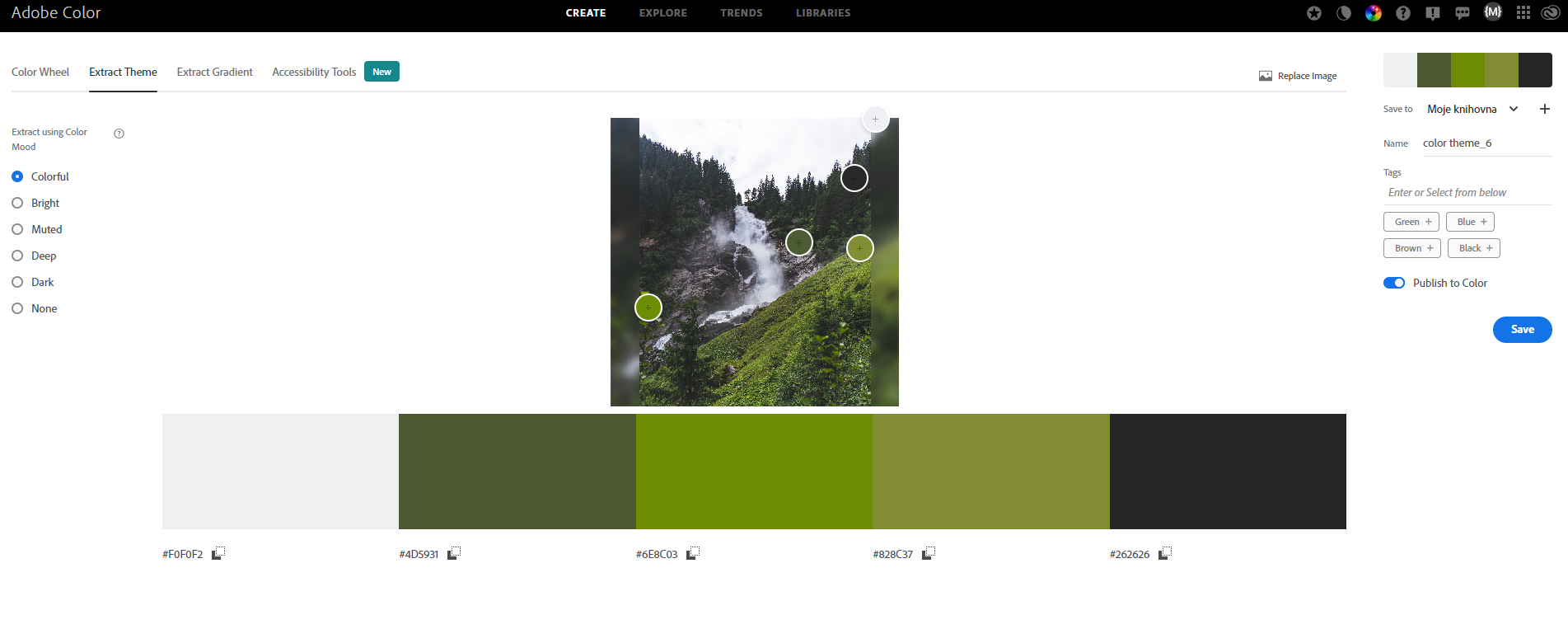
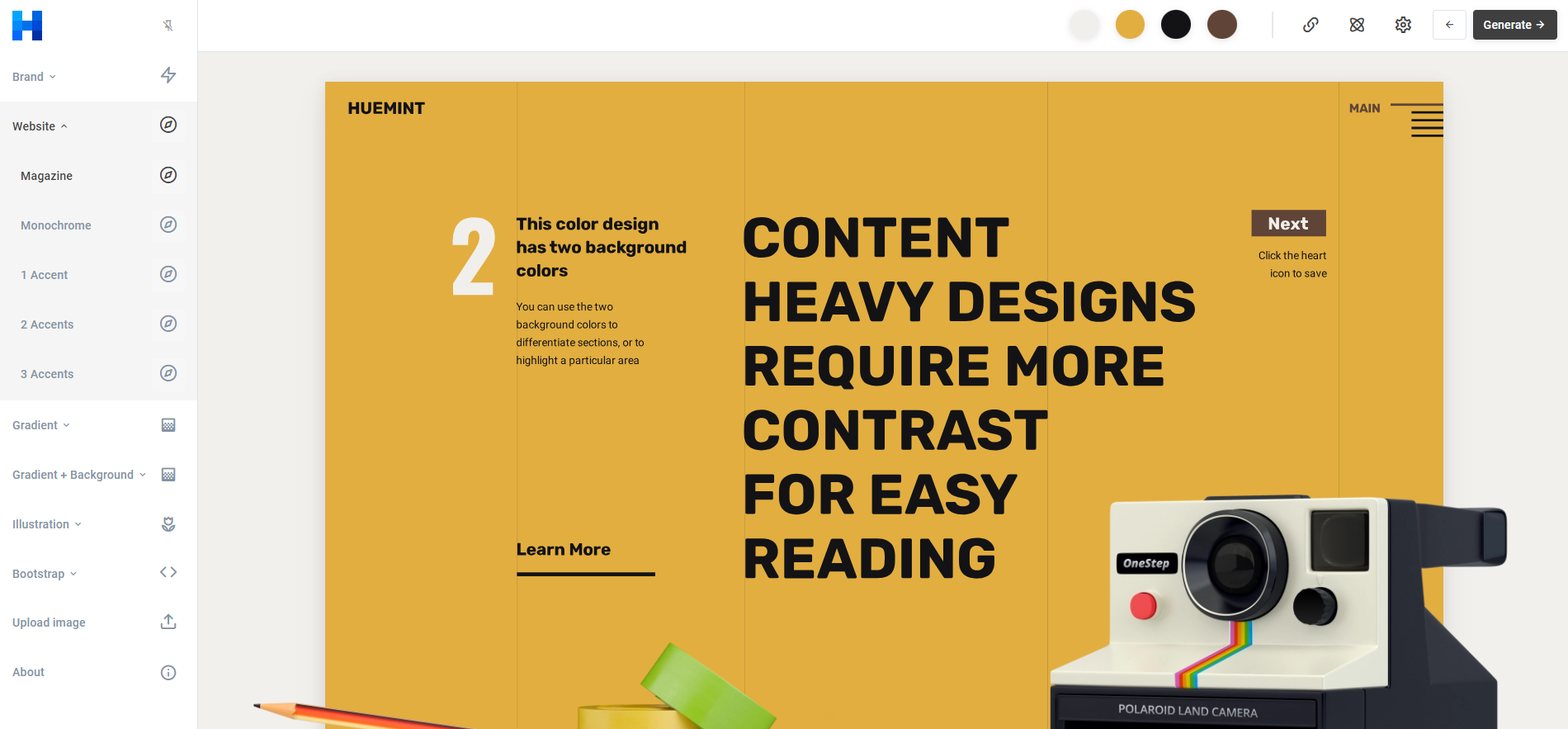
Here, you can discover fundamental color wheels for finding complementary colors and more. However, what's truly intriguing is the 'Extract Theme' option. With this tool, you can upload an image, and it will extract a color palette from it. This feature is particularly useful when you need to design around a specific object, photograph, or even extract colors from screenshots.
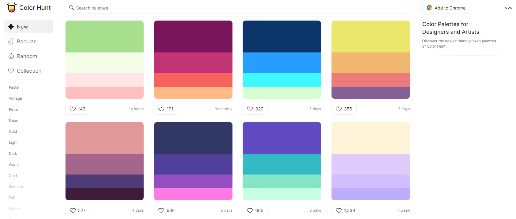
These websites are fantastic whether you're seeking pure color palettes or simply unwinding while generating random color combinations (I'm referring to Coolors - just press the spacebar and relish in the palette generation 😊).
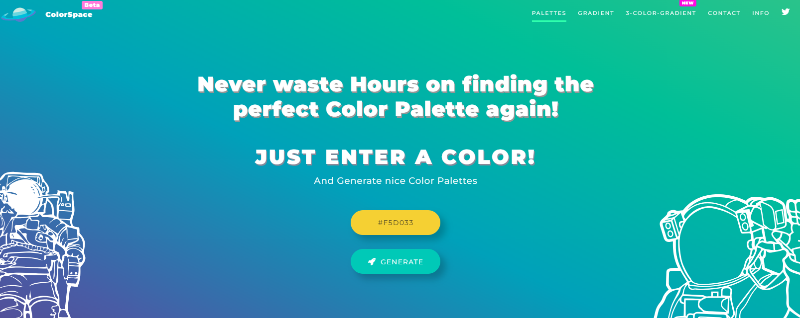
I stumbled upon this tool not too long ago, initially using it solely for generating CSS for gradient colors (love it!). Later, I discovered that it also features an excellent palette generator. If you have a dominant color in mind, simply copy its HEX code and witness the palettes it generates for you.
I hope that some of the tools I've listed here were new to you, even though they are relatively popular in the community. If this article provided you with valuable insights, I would appreciate it if you could like and perhaps share it as well! Thank you!
EDIT: I've decided to gradually add more tips for online apps as I come across them in my work.
I came across this cool online app while testing different colors for my django project. I love the ability to choose different types of sample content and the ability to generate multiple color variations and see them right away.